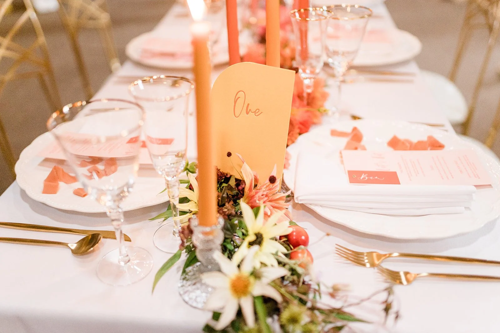
Finding Your Niche As A Wedding Stationer
When I started designing wedding stationery, I was so excited to be doing what I loved and to be working with clients that at I didn’t stop to think what I wanted to do. Who did I want to work with? What was my style? I look back on some my early designs, and while I am still proud of the work I created, it was not me. Versatility is a wonderful thing, but it is far easier to stand out in a crowded market if you know you have a clear visual identity.
So, here are my top tips in finding your niche:
Check that there is a market for the product you want to create
Finding a style that works for you is important, however it is equally important to ensure there is a market for the product you want to create. There will be other people in your playground, though you should be able to bring something different and special to the table. Google keywords that describe the client you want to serve, for example, “contemporary letterpress stationery” or “romantic, whimsical invitations” and see what the competition and size of the market looks like.
Think about the clients you want to serve
Who are they? What do they do for a living? Where do they go on holiday? Where do they shop? What does their living room look like? What does their wedding look like?
It is natural for your target market to be a more aspirational version of you; after all, they will be looking to buy from you because there is some kind of affinity there. You may also find you have more than one profile: my semi-custom clients are different to my bespoke clients, although they have some commonalities. Name them! This will help you talk to them.
Design for you
Once I realised I was frequently getting pigeonholed into creating work that didn’t quite set my heart on fire, I decided to do something about it and designed suites for me and the people I wanted to work with. I imagined the sort of people I wanted to serve and the venues they would be getting married at, and created suites that I could showcase on my website as work I loved and was proud of.
Always design with your dream client in mind
This is particularly important when designing semi-custom suites and showcase items for shoots. Set yourself a brief: what is the venue? Who is your client? What is the vibe your client is aiming for? Think about the colour palette and how you can work this into your artwork. And, particuarly for semi-custom designs, make sure it is versatile! Don’t for example include a venue illustration as a header unless you are willing to personalise this over and over again.
And for shoots, don’t agree to take part just because you need beautiful photographs for your website. Check out the photographer - does their style fit with your brand? And make sure the brief fits with the type of client you want to attract.
Test your products
Share you work on social media; encourage interaction and feedback. Pit your own designs against each other and see which your follower and client base responds more positively. Ask questions! And don’t be afraid to act on feedback if your work doesn’t land as you had hoped.

